
IN PARTNERSHIP WITH PRESTIGE BY FLEETWOOD
The award-winning interior designer on choosing the perfect colour for your space …
Arlene McIntyre has over 25 years experience across residential, commercial and hospitality interiors, and her work is recognised for its creativity and considered detail. Her exclusive collection with Prestige by Fleetwood – Fleetwood’s finest paint developed through extensive collaboration with interior designers – combines the very best resins, pigments and air purifying technology to provide a rich, durable finish designed for modern living.
You’re an expert in your industry who could collaborate with any brand – why Fleetwood? I’ve spent my career creating homes that are beautiful, timeless and designed to be lived in, and Fleetwood shares that commitment to quality, craftsmanship and innovation. This Irish brand is also incredibly important to me. I’ve always believed in supporting Irish companies that invest in excellence and produce world-class products, and Fleetwood has a longstanding reputation for doing just that. There was a natural alignment between us, not only in our approach to design, but also in sustainability. This isn’t about putting my name on a product; it’s about creating something genuinely innovative that elevates interiors while standing the test of time. From the very beginning, Fleetwood embraced that vision and gave us the time, expertise and freedom to develop something truly exceptional together.
It took four years to find the right formulations for Prestige Multi-Surface Matt – what did that process entail? It was an incredibly detailed process. We wanted to create a true multi-surface paint with a luxurious matt finish that could be used seamlessly throughout a home, from walls and woodwork to cabinetry and furniture. Achieving that balance between beauty and performance required extensive testing and refinement. We were constantly reviewing colour depth, durability, application and finish, ensuring that every detail met our standards. Four years may seem like a long time, but creating something truly distinctive and long-lasting can’t be rushed.

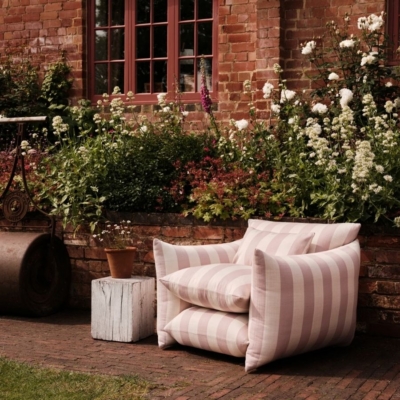
Blue Rowen from the Prestige X Arlene McIntyre collection.
What makes it different in the market? The uniqueness lies in its versatility and finish. Prestige Multi-Surface Matt delivers a beautifully rich, velvety appearance while offering the durability people need for modern living. Traditionally, achieving durability often meant compromising on aesthetics, particularly when it came to woodwork and cabinetry. This collection allows homeowners and designers to create a cohesive, sophisticated look across multiple surfaces using one luxurious finish. It brings a softness and elegance to interiors that’s difficult to achieve with conventional paints.
Matte is trending – what’s its advantage over gloss? Matt finishes create a sense of calm and sophistication that feels incredibly contemporary. They absorb light rather than reflect it, which allows colours to appear richer and more nuanced. I also find that matt finishes help to create a more seamless and architectural feel within a space. While gloss certainly has its place, particularly in period properties or where a decorative statement is desired, matte tends to feel softer, more understated and, ultimately, more timeless.

Blue Rowen from the Prestige X Arlene McIntyre collection.
What are some of your favourite colours? That’s always a difficult question because colours resonate differently depending on the space and the light. However, I’m particularly drawn to Blue Rowen for its wonderful depth and Curragh, which feels grounded and natural. Deauville is another favourite because it brings a warmth that works in both contemporary and traditional settings. These are colours that feel enduring rather than fashionable, which is something I always strive for.
What colours are trending this year? We’re seeing a continued move towards colours that feel connected to nature and wellbeing. Soft earthy greens, warm neutrals, rich blues and muted clay tones are all proving popular. People are becoming more confident about using colour, but they’re choosing shades that create atmosphere and comfort rather than making a bold statement for the sake of it. There’s a growing appreciation for colours that bring a sense of calm, authenticity and permanence to a home.
I always encourage people to think about colour as a conversation rather than focusing on a single shade.
What was the inspiration behind the names of the paints? The names were inspired by places, landscapes and moments that have left a lasting impression on me, throughout my life and travels. Colour is deeply emotional and I wanted each shade to tell a story beyond its visual appearance. Whether it’s the natural beauty of the Irish landscape, the elegance of a coastal destination or a memory associated with a place, each name was chosen to evoke a particular feeling. The collection is very personal in that sense, as every colour has a narrative behind it.
How do you pair colours in interiors? Curragh pairs beautifully with warm off-whites and natural materials, such as oak and linen. Blue Rowen works wonderfully alongside neutrals and brass accents, creating a sense of understated luxury. Deauville can be layered with deeper earth tones or gentle greys for a sophisticated, balanced scheme. The collection was designed so that many of the colours sit harmoniously together, allowing homeowners to create depth and interest while maintaining a cohesive feel throughout the home.

Sisal from the Prestige X Arlene McIntyre collection.
Have you featured these in any of your favourite projects? One project that stands out is our Merrion Square Penthouse, which remains one of my favourite projects to date. The apartment has extraordinary views over Dublin’s historic Georgian core, and the design called for a palette that felt quietly luxurious. Several shades from the collection informed the overall scheme, helping to create a sense of cohesion and calm while allowing the architecture to take centre stage. The project was conceived as a retreat above the city, with a layered palette of neutrals and rich accent tones creating warmth and depth throughout the interiors. Sisal featured heavily in the hallway and circulation spaces as the perfect choice. It creates a welcoming atmosphere while acting as a versatile backdrop for artwork, bespoke joinery and architectural detailing. Blue Rowen was another key colour to bring richness and character to the scheme, creating moments of contrast while still feeling calm and sophisticated. It’s a shade that changes throughout the day as the light shifts, which made it particularly effective in a penthouse setting flooded with natural light.
Prestige Multi-Surface Matt at Fleetwood:
Prestige Multi-Surface Matt has been carefully developed to deliver a subtle 4% sheen, the perfect luxurious matt. The result is a smooth, contemporary finish with just the right amount of light reflection. Soft, refined and effortlessly elegant, it enhances both modern and traditional interiors while allowing colour to remain rich and beautifully nuanced throughout the day. Available in the full Prestige palette, including the exclusive designer collections by Arlene McIntyre and Róisín Lafferty, Multi-Surface Matt allows your favourite shades to flow seamlessly across every surface in your home. @fleetwood_paints
SEE MORE: The Art Of Colour With Róisín Lafferty