IN PARTNERSHIP WITH PRESTIGE BY FLEETWOOD
The Irish founder and creative director on choosing the perfect colour for your interiors …
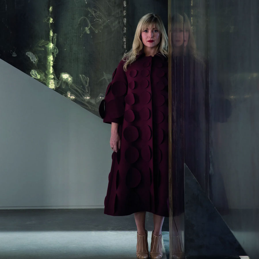
Róisín Lafferty is known for creating captivating, immersive interiors that balance creativity with uncompromising attention to detail. Her intuitive approach to design has resulted in spaces that feel deeply personal, layered and engaging. Her exclusive collection with Prestige by Fleetwood – Fleetwood’s finest paint developed through extensive collaboration with interior designers – combines the very best resins, pigments and air purifying technology to provide a rich, durable finish designed for modern living.
You’re an expert in your industry who could collaborate with any brand – why Fleetwood? What drew me to Fleetwood was their commitment to innovation and a shared ambition to create something truly considered, together. For me, creating my Prestige by Fleetwood collection was never simply about developing paint; it was about creating something I could truly stand over and use instinctively across our own interior projects. Fleetwood brought incredible technical expertise to the collection, which gave me confidence in the finish and allowed me to focus on the creative side: the colours, how they interact with light and materiality, and the atmosphere they create. There was a natural alignment that made the collaboration feel very organic.
It took four years to find the right formulations for Prestige Multi-Surface Matt – what did that process entail? The process was incredibly rigorous and intentional. We were not interested in creating another decorative paint collection; we wanted to develop something that could perform beautifully across multiple surfaces, while maintaining an elevated and refined finish. Over four years we tested colour, sheen and durability extensively, refining the formulation until it delivered both aesthetically and technically. Multi-Surface Matt was particularly important because it us to achieve an uninterrupted colour experience across walls, woodwork and cabinetry. For me, it was about ensuring that the finish felt as luxurious and considered as the colours themselves.

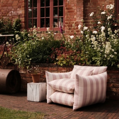
Zallal from the Prestige X Róisín Lafferty collection.
What makes it different in the market? It’s been developed through the lens of interior architecture. Colour is never an isolated decision within our studio; it’s always connected to light, materiality and atmosphere. We wanted to create a collection that worked holistically within a space, rather than as individual colours viewed in isolation. Prestige Multi-Surface Matt allows colour to flow more seamlessly across surfaces, creating a stronger sense of immersion and cohesion. There is a softness and sophistication to the finish that feels incredibly contemporary, while remaining timeless.
Matte is trending – what’s its advantage over gloss? I love both, but they create very different experiences. Gloss has a wonderful ability to bring drama, reflection and energy into a space, whereas matte offers softness and depth. What I love about Multi-Surface Matt is its ability to create a more immersive environment. Because light reacts differently to matte finishes, colour can feel richer and more enveloping, allowing the architecture of a room to take centre stage. It creates a quieter confidence, which I think people are increasingly drawn to.
What are some of your favourite colours? I find it difficult to choose because colour is so emotional and contextual, but there are a few that I return to often. Zallal is incredibly special to me. Our CEO Becky Russell and I chose it for our shared office within the gallery, paired with a Dahana ceiling. It wraps around you in a way that feels almost velvety and comforting. Malin is another favourite, used within our blue meeting room space. It’s a soft and pale yet distinct blue that feels fresh and calming, which we paired with bold red lacquer elements alongside a sculptural table to create tension and energy. I also love Moves Like Jagger, which features within the first-floor study of the gallery, just before entering the blue meeting room. Its vibrant red undertones radiate warmth and bring a wonderful sense of character to the space.
We’re moving away from trend-led colour choices and towards more emotional and personal palettes.
What colours are trending this year? There’s certainly a growing confidence around richer and more grounding tones, colours with greater depth that create atmosphere and connection. Rather than following a singular trend, I think people are becoming more interested in colour as a way of shaping how a space feels. Earthier tones, layered neutrals, sophisticated reds and expressive blues continue to resonate because they bring individuality and depth into interiors.
We love the names too – from Mr Huxley and Lady Harper to Lover’s Walk – what was your inspiration? Naming the colours was one of my favourite parts of creating the collection because each shade carries its own story. I never wanted the palette to feel anonymous or purely technical. Some are deeply personal. Mr Huxley and Lady Harper are named after Becky’s much-loved Italian Greyhounds, with the softness of their coats directly influencing those grey tones. Others are inspired by experience. Moves Like Jagger was imagined around the energy of celebration and togetherness, its red undertones carrying movement. Lover’s Walk takes its name from one of our residential projects, celebrated for its romantic use of expressive red tones and sense of connection. For me, colour is emotional and storytelling plays a huge role in how we connect with it. The names allow each shade to carry a narrative rather than simply existing as a colour reference.

Ceppo from the Prestige X Róisín Lafferty collection.
How would you pair these colours in interiors? I always approach colour compositionally rather than individually. One of my favourite approaches is wrapping a single colour across walls, joinery, doors and even ceilings. When colour flows continuously across surfaces, it creates a stronger sense of cohesion. Rather than breaking the room apart visually, it allows the architecture itself to hold the composition. From there, I like to introduce contrast and richness through materiality and texture. Timber, lacquer, natural stone, metal and textiles all interact with colour differently, and bring character to the scheme. For me, it’s about creating balance; allowing colour to form the foundation against materials.
Have you featured these in any of your favourite projects? Many of the colours within the collection have evolved through our own projects, which is what makes them feel so authentic to our studio and design language. Zallal emerged through Base & Boon Zallal in Saudi Arabia, while Cobalt became synonymous with Cobalt Townhouse in Ireland, where a vivid blue cube formed a defining architectural gesture within the home. Ceppo featured within The Estate in Wicklow, reflecting our long-standing appreciation for Ceppo di Gré stone and its influence on our material palette, while Necchi became integral to the layering explored within Tonal Haven in Connemara. What I love is that these colours were never imagined in abstraction. They have been tested through real spaces and refined through the design process itself, which gives the collection an authenticity that feels very true to our studio.
Prestige Multi-Surface Matt
When it comes to decorating, one of the biggest challenges can be creating consistency across every surface in a room. Walls, ceilings, woodwork, doors, paneling and furniture often require different products, primers and finishes making the process complicated and time-consuming. Designed for ultimate versatility, Prestige Multi-Surface Matt adheres seamlessly to almost any surface without the need for a primer. It’s a beautifully balanced formula that simplifies decorating while still delivering the premium finish expected from Prestige by Fleetwood. It delivers a subtle 4% sheen, the perfect luxurious matt. Its moisture-resistant formula makes it ideal for kitchens, bathrooms and utility spaces, while its durable finish resists peeling, blistering and mould growth.
At the heart of the Prestige range is the Core Collection, 60 expertly curated colours that form the foundation of this premium palette. The collection brings together some of our most loved shades from the past eight years, including favourites such as Coco, Monet, Kensington Grey, Bofin Fern and Sylvia Beach, alongside a series of carefully developed new tones inspired by the evolving Irish interiors landscape. Every colour has been thoughtfully selected to complement the unique qualities of our natural light and the way colour behaves within our homes. Shades such as Marble and Snug reflect the soft, muted beauty of Irish mornings, while tones like Falling Slowly and The Quiet Light capture the understated elegance of contemporary Irish design.
Available in the full Prestige palette, including the exclusive designer collections by Róisín Lafferty and Arlene McIntyre, the result feels timeless, contemporary and distinctly connected to Irish living. Discover the Prestige by Fleetwood collection and find your nearest stockist today. @fleetwood_paints