Embracing the essence of the era …
Commercial interior designers are obsessed with the user experience. It’s not just about designing a commercial space that looks good (although aesthetics is very important), but a functional and well-optimised space that can facilitate a certain function, such as an office, with good workflow and a sense of calm, or a restaurant that’s functional and inviting.
But what if you bring the discipline and insights of a commercial designer into the residential arena? That’s where the magic can happen, according to interior designer Stephanie O’Sullivan, who translated 20 years’ experience as a commercial designer to this mid-century mews house in Dublin.
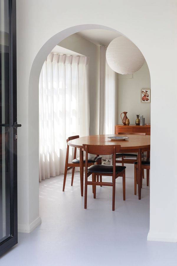
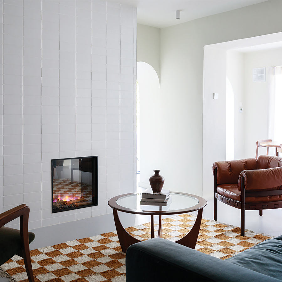
The mid-century G-Plan table and sideboard are true to the period.
Originally a warren of tiny rooms, O’Sullivan tackled the flow of the mews as she would a commercial project, with intent, replacing windows in the entrance hall and kitchen with sliding bifold doors and removing all the internal doors downstairs, creating arches at the openings to blend the spaces. A small entrance hall now leads to an open-plan living and dining room and a separate kitchen. Upstairs, a primary bedroom suite has been created with a walk-in wardrobe and double entrance bathroom, so that guests using the study/bedroom have access.
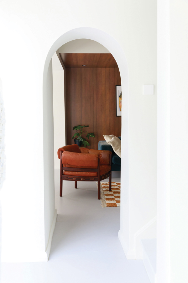
Arches have replaced the doors to create better flow.
Although overall the space is just 60 square metres, it feels deceptively spacious. And this is where the commercial thinking is deployed to clever effect. As the space is compact, Stephanie wanted to bring continuity to the entire house, choosing one floor finish only. Forbo Marmoleum in a light grey shade, a commercial grade product, is both soft underfoot and seamless, delivering a unifying effect. Made from linseed, it is 100 per cent natural and is very easy to maintain. “It’s naturally sterile,” says O’Sullivan, “so is often used in healthcare settings.”

The arch from the kitchen to the living area with birch plywood laminate finish; walnut laminate panelling in the living area echoes the mid-century furniture.
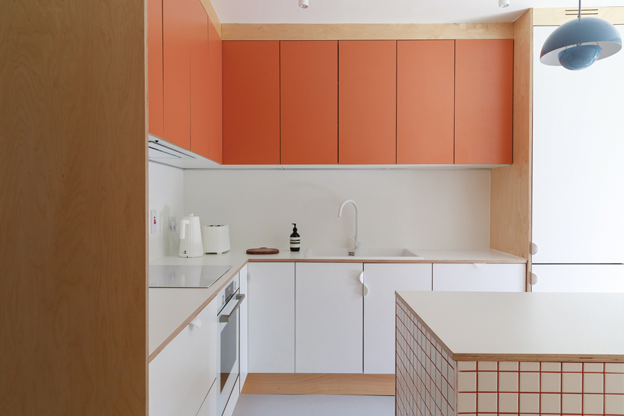
A nostalgic shade of orange in the kitchen recalls the mid-century period.

The curved kitchen island with square-format tiles and coloured grout, and a pair of blue pendant lights by &Tradition.
O’Sullivan’s experience as a commercial designer has taught her the importance of controlling sound and light. “The Marmoleum is laid over a perfect subfloor so it’s quiet. And while the Vescom Swan voiles, more commonly used in commercial fitouts, have the effect of diffusing the light and providing privacy, they are also very effective at reducing sound.”

With the owners’ brief to create a mid-century style interior, O’Sullivan sought to combine their collection of mid-century finds with well-chosen materials that are associated with the period. This too became an opportunity to use commercial nous: O’Sullivan commissioned a joiner to make the kitchen to her bespoke design using Formica laminate and birch plywood with a central tiled island. The underside of the stairs forms part of the kitchen units with bespoke built-in cabinetry in birch plywood. This also houses the feature arched transition with hidden storage. The wall and ceiling panelling is natural teak Formica timber laminate downstairs and oak upstairs. “All the finishes have a high sound absorption level, are sustainable and because the design is bespoke, every millimetre can be used to great effect.”
Photography by Doreen Kilfeather; @dkilfeather


