An unconventional layout, a reimagined interior and strong design direction breathes new life into a classic Irish Georgian farmhouse. Find these never-before-seen pictures below and get a real grasp the design …
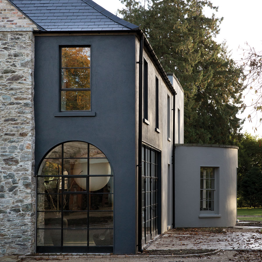
When its owners bought this late-Georgian farmhouse a number of years ago, it might have been described as “a very distinguished country residence” in estate agent speak. Once upon a time, it would have been a typical handsome four-bedroom example of its genre but, in more recent years, subjected to unsuitable alterations and add-ons, it was in need of a rethink. It presented one of those classic opportunities for the right people to buy it and bring it back to its former glory.
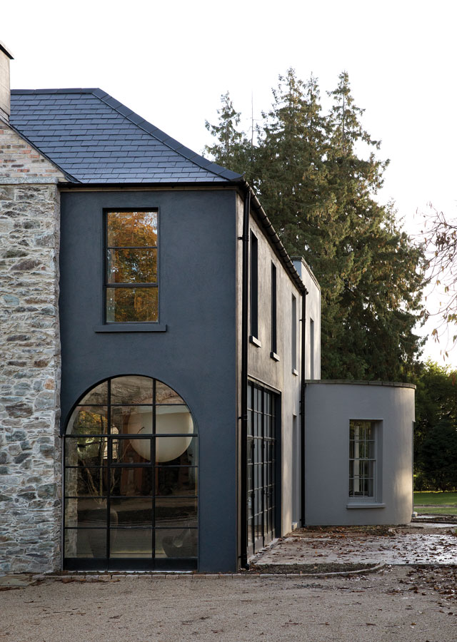
The new owners’ ambitions far exceeded a merely glorious renovation. This typical example of an Irish Georgian farmhouse has been completely reimagined with an unconventional layout and an interior that links old and new with overlapping materials and style details. It is the outcome of a two-year design process by interior design and interior architecture firm Róisín Lafferty, to a brief that was unequivocal: the clients wanted an “industrial aesthetic”. Lafferty’s mission was interpret the brief, accentuate the building’s original features and configure and decorate the newly built extension – an open shell – to ensure the connection between old and new was optimised.


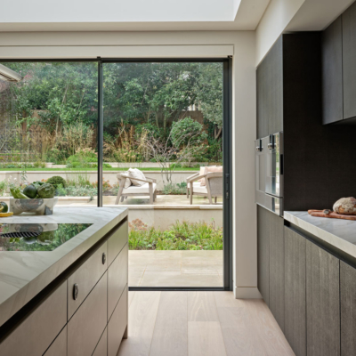
The kitchen island is in J’Adore quartzite by Miller Brothers. The stainless steel light is by Giffin Design, customised to extend the entire length of the island. The coffee table was put together by combining a base from one table with a mirror for the top. The rug is by Rugvista.

A view from the contemporary extension to the living room in the original part of the Georgian farmhouse.
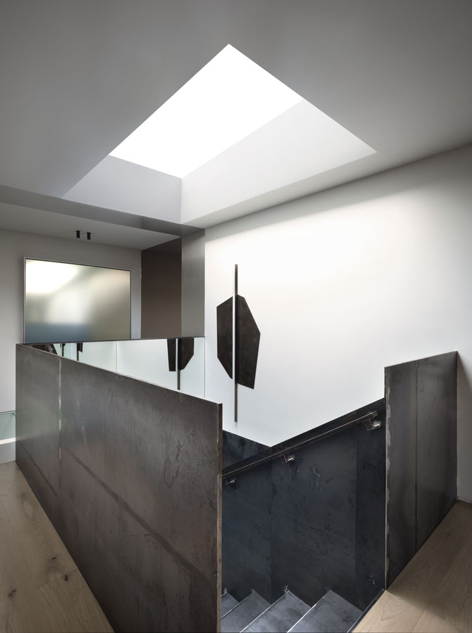
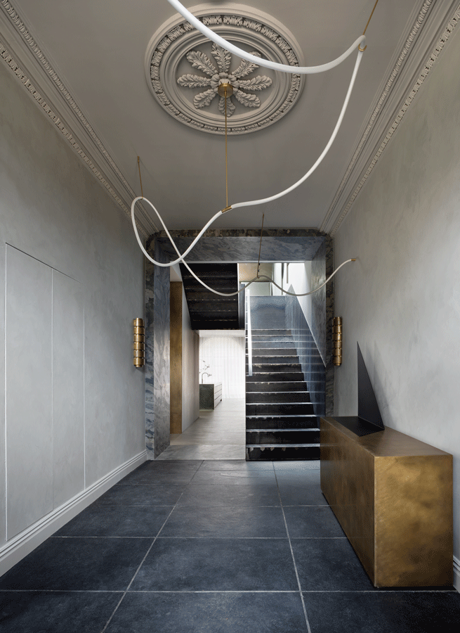
A view from the entrance hall of the original part of the house to the contemporary extension beyond. The large-format slate tiles on the floor, steel staircase, the custom-made aged brass console and the flexible light by Morghen Studio hint at the unexpected interior within.
Lafferty’s expression of “industrial aesthetic” was to create an interior where the materials are revealed, that shows the inner workings (you can see the weld marks on the steel staircase), that has a solidity and authenticity that can withstand wear and tear, and that transcends trend. Although the residence appears open plan, without distinct walls, Lafferty interjected forms to sub-divide the space, creating function-specific areas, important to this family with three young children. The forms are variously stone blocks, extruded storage units and mirror and brass-clad ceiling components, all of which are more like sculpture than structure. These interjected elements create passageways framing spaces and views. “We have created an immersive experience, where the interior design forms are like sculpture, the light fixtures and furniture are like art,” says Lafferty.
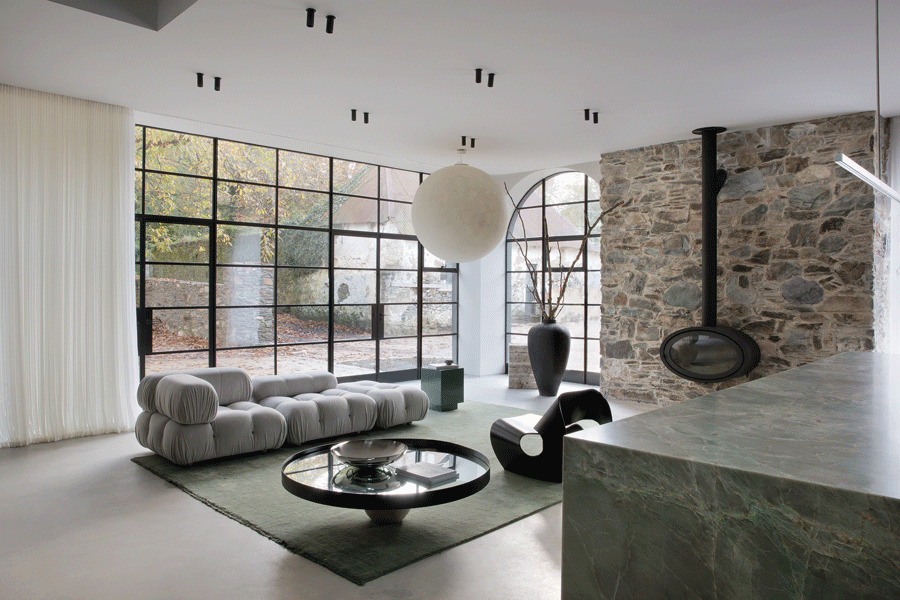

The kitchen overlooks a courtyard with the original coach house, and is designed with mood changes in mind: at the Crittall windows are automated sheer drapes in linen by Mix & Match. It has a flexible layout with a B&B Italia sofa from Minima, and a sculpted chair by Brodie Neill from Made in Ratio. The urn is by Rock Hill. The stove is from Heatco.
It is a complex design which appears simple and streamlined. The repetition of materiality from one space to the next creates a sense of flow, harmoniously connecting old and new parts of the house.
It is in the entrance hall where we see the first defining feature of Lafferty’s design. The main staircase, in mild steel, is austere, complementing the refined stone portal, the large-format slate tiles and aged brass console contrasting with the gentle elegance of the Georgian fanlight and ceiling rose. The visual story unfolds from here with a pared-back moodboard that features polished plaster, stone and steel – materials that are inherently flawed and that just improve with age. Informing the design approach was Lafferty’s decision to defer to the classic farmhouse design thinking around how spaces are used day to day: “It’s about everyone mucking in, gathering around, not being precious.”

The darkest, innermost part of the house was made more light by the introduction of a solid glass ceiling, creating a connection between ground and first floors.

The living room was designed for family use, and has a grounded and intimate feel with polished plaster walls and coffee table. The flexible light by Morghen Studio echoes the one in the hall. The leather sofa is by Montis from Minima, and the mid-century desk is from acquired.ie. Simple disc wall lights between the original sash windows are from Artemest, and the wall light in the marble opening is by Eichholtz.
As with every project by Róisín Lafferty, the procurement policy is to find wonderful items and suppliers, from all over Ireland and from further afield, and not to rely on the predictable. It’s rare that the firm repeats the same item in another project. The exception is when it comes to signature hallmarks like their marble plinths (made from marble off-cuts left over from projects), overscaled brass mirrors and lacquered forms. These are the basis of Róisín Lafferty Essentials, a new collection of interiors pieces, designed by the creative team. “From the moment we saw the property, we fell in love with its old-fashioned, historical presentation,” says Lafferty. “To have the opportunity to create a cool interior within a classic Irish typology, to have the freedom to play with the interior architecture, this was the dream for us.”

The master suite on the first floor comprises a central block clad in polished plaster and mirror which generates spaces within a space, with bedroom, dressing room, bathroom and shower.
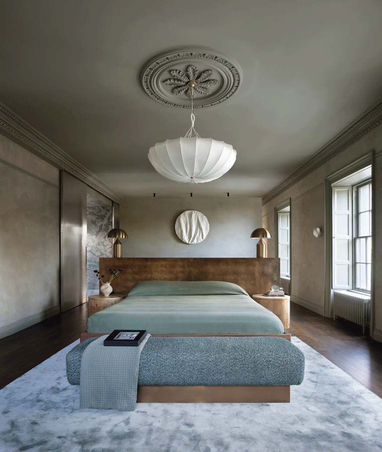
In the bedroom, the custom rug is from Cremins Moiselle. The headboard in aged brass and timber and the bedside lockers were both custom designed by Róisín Lafferty, and made by Christoff. The silk pendant light is from Gong.
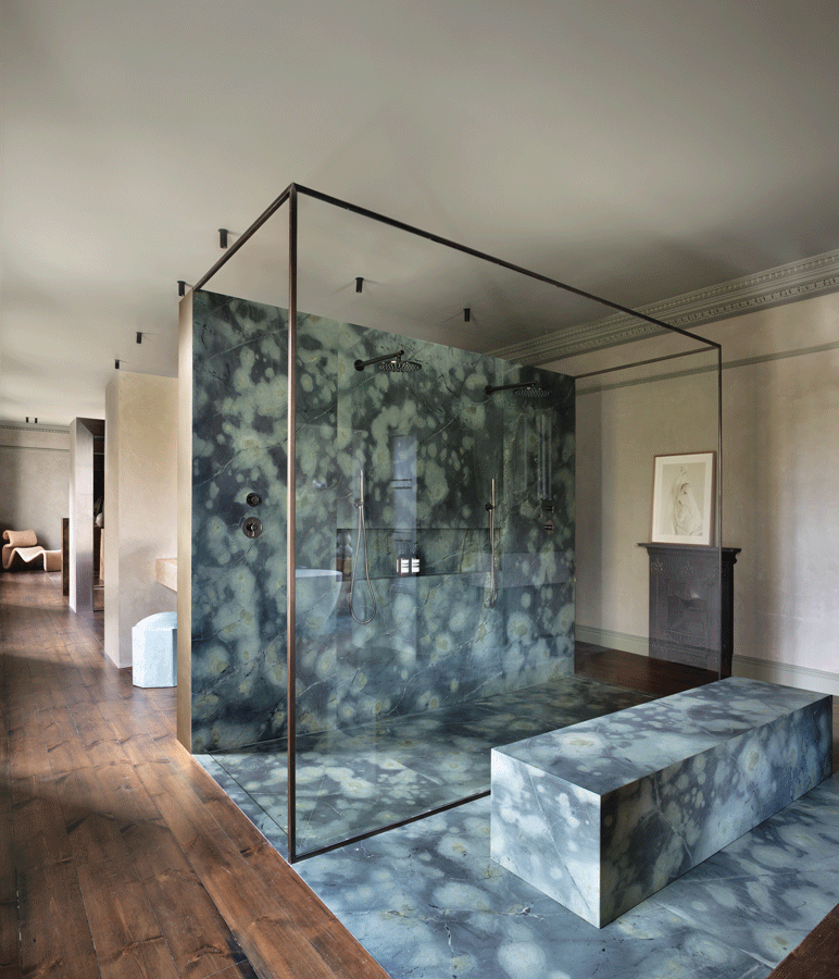

Stone free-standing shower and custom stone sinks by Miller Brothers.

Sanitaryware is by Crosswater from Deluxe Bathrooms.
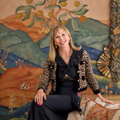
DESIGNER’S EYE: RÓISÍN LAFFERTY

Róisín Lafferty, eponymous founder and creative director of the design firm formerly known as KLD, is launching the Róisín Lafferty Essentials collection, which includes some of the company’s signature details. Plinths, made from marble off-cuts reimagined into furniture, overscaled brass mirrors and durable brightly coloured lacquered pieces, suitable for indoor and outdoor use, are just three items now available from www.roisinlafferty.com. @roisinlaffertyofficial @roisinlafferty.essentials
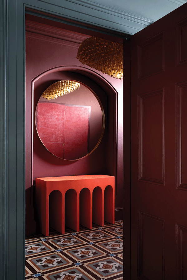
Róisín Lafferty Essentials collection.


