Mid-century meets Palm Springs …
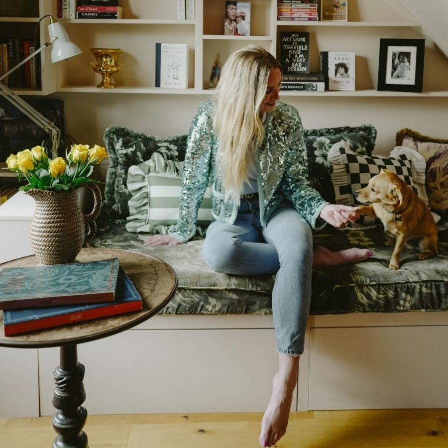
Designing for clients is, in many ways, the easier half of what I do. You ask the right questions, listen carefully and eventually a brief emerges – something to push against or serve. Designing your own home is an entirely different exercise. There’s no client to disappoint except yourself which, it turns out, is both liberating and quietly terrifying. When my partner and I moved into our townhouse, we inherited the prevailing mode of the moment: dark walls, moody lighting, the kind of interior that references a Soho members’ bar. Beautiful in its way, but not ours. We wanted joy. Optimism with backbone. Colour that didn’t apologise for itself.


The hallway came first, both practically and conceptually. In a four-storey townhouse, the stairwell is the spine of the home – you move through it a dozen times a day without really seeing it, which is exactly why I decided it deserved to be seen. I wrapped it top to bottom in lilac, peach and pink by Yes Colours, drawing on a sun-washed Californian palette that felt a world away from the weather. The instinct came from a blend of Memphis Design, the work of Slim Aarons, and sun-drenched trips to California. People walk in and visibly shift. That was the intention: a space that lifts the mood before you’ve even taken your coat off. I call it the dopamine hallway.

The living room is where the house really tells on me – a curated accumulation of a life spent collecting – and I use that word loosely because half of what’s there was found rather than sought. The 1960s crept in with warmth and confidence: sun-washed brown tones, colour drenching, a wit to the layering that stops it ever feeling solemn. The sofa sets the tone immediately. Bespoke, in a bold stripe, it was a collaboration with Louisa at Colours of Arley and the moment I saw the fabric I knew exactly what it reminded me of – Caramac. That particular caramel-gold stripe takes me straight back to childhood. Good design does that, if you let it. Layered across it are House of Hackney cushions and nearby sits my grandfather’s striped chair. I can’t look at it without seeing him in it. Some pieces earn their place through provenance alone.
The rest of the room is a timeline in furniture: a credenza found in Maida Vale dating to 1964, rosewood Archie Shine dresser, travertine marble coffee table from 1971 that I would rescue first in a fire (with the help of some strong people!). Art Deco sconces throw a warmth no overhead light could replicate. In the corner is my 1961 surreal Italian duck lamp. I’ve been asked about it more times than I can count and it’s been with me for years. The Kaleidoscope artwork is by an old friend, Paul Solomons Studio, and it holds the room together. And then there’s the china. The weird and wonderful accumulation of things that make people pause and ask questions. I’m unapologetically obsessed.

The primary suite is where I allowed myself the most indulgence. Chocolate-toned walls by Farrow & Ball wrap the bedroom in a depth that reads as cocooning rather than heavy. The difference lies in everything else in the room: silk eiderdowns from Preen Home, mid-century furniture, the ghost of an Art Deco gesture here and there. Against all that, the ensuite becomes a deliberate counterpoint in peach tones.

What strikes me now, looking at the house as a whole, is how coherent the instinct was. The palette shifts from room to room, but the underlying logic – warmth, colour used with intent rather than caution – runs throughout. Designing your own home won’t make you a better designer, but it will make you more honest. When there’s nothing to hide behind, you find out fairly quickly what you believe.

Need to know: This summer, Zoe Willis is relocating part of her Zoe Willis Design practice to Dublin. Follow along @zoewillisdesign.