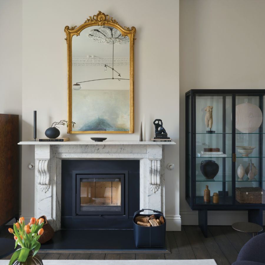
This year’s colour vibe is joyful, eclectic, mood lifting and artisanal, according to these colour experts …
Move over “Setting Plaster” – one of my favourite colours from Farrow & Ball’s extensive paint range, known for their iconic names. The famed Dorset-based paint experts just announced they’re launching twelve new colours. Nine are new creations, while three are archival shades – Sap Green, Broccoli Brown and Etruscan Red – perfect timing for spring renovations, which will no doubt create endless scope for perusing the paint charts and composing hypothetical mood boards.
The new colours range from a deep terracotta to a crisp blue, an earthy green to a delicate pink, with inspiration including a dependable garden tool, folkloric fireplaces and even the humble duster. Joa Studholme, Colour Curator for Farrow & Ball explains: “Over the last few years, we’ve relished living with colour. It’s opened our eyes to all the shades surrounding us, which we often don’t think about. The treasures right under our noses. Now, we’re ready to embrace more colour and celebrate these unsung heroes in our homes.”

Marmelo
Interesting names and inspiration abound. Studholme says “Marmelo” is named after the quince that inspired marmalade. “Who could fail to be comforted by that familiar orange reminiscent of warm, buttered toast and conversations around the breakfast table?”

Douter
Another new shade between Inchyra Blue and Green Smoke, inspired by traditional brass candle snuffers. “I always think candlelight brings a magical quality, whether it’s a dinner party or just a cosy evening in,” says Joa.

Dibber
For those who love “Dead Salmon” (if you know, you know!) then “Scallop” will appeal. It’s lighter and softer, inspired by the curved shape of the shellfish. Gardeners may like the down to earth green called “Dibber” named after the tool that creates holes for planting seeds or bulbs.

Kakelugn
“Sizing” has blue undertones, while “Kakelugn” is another blue shade, named after the folkloric fires of Sweden often decorated in this colour.

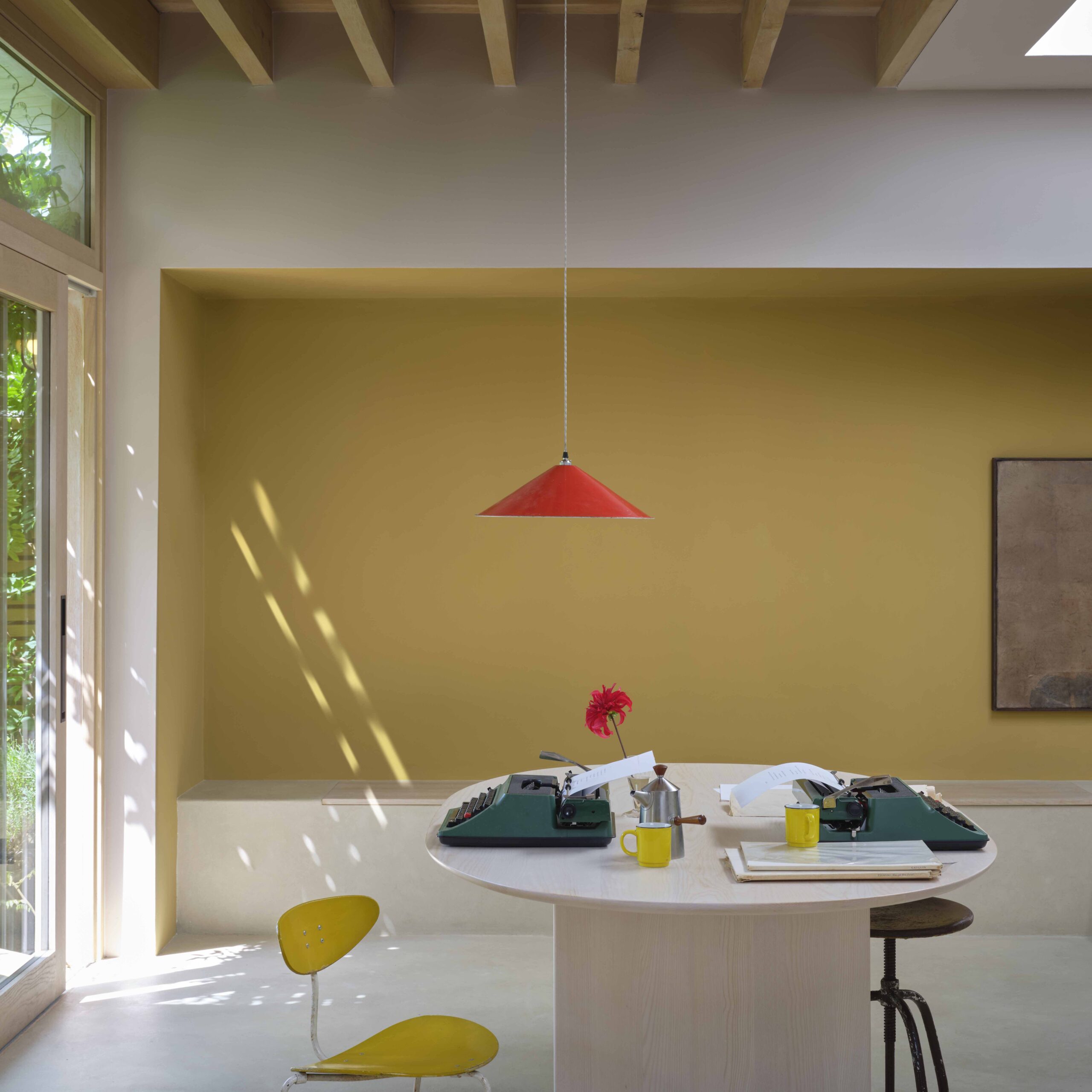
Duster
This deep ochre is an aged yellow that can’t fail to uplift.

True Joy
Dulux has gone one step further and named its yellow paint “True Joy” as the colour of the year because it taps into the increasingly popular dopamine decorating trend of filling your home with bright colours that exude happiness. Dulux Colour Consultant Jane Witter says, “ This deep, vibrant yellow brings that sense of joy and warmth into your home, no matter the season. Maybe a leap too far for some to use all over; however, it’s in the clever colour distribution in a room and surroundings that this hue plays a joyful role, creating moments of positivity and capturing an inviting atmosphere. True Joy pairs beautifully with earthy tones and warm wood accents, making every room feel like a cosy, sunlit retreat’’.
SEE MORE: Make A Big Impact With Dark Chocolate Tones In Your Home